 These are Trix cereal boxes one is a retro release and the other is the normal release. They both look very similar but with slight differences. They've still used the only green on the box for logo. I'm guessing they did this so the name would have a popping effect to it. The rabbit on the other had is very different. One seems very relaxed while the newer one has an extreme expression of excitement and energy. Thy might have changed that because children would move towards that expression more. They might have re released the older box so more adults would start buying the cereal. The cereal itself is also more vibrant and colorful in the newer trix box. I personally like the older one better, It has less going on with more of a chill yet cool factor about it where the newer box to me screams eat me I'm full of sugar and excitement.
Wednesday, December 16, 2009
Trix Box
These are Trix cereal boxes one is a retro release and the other is the normal release. They both look very similar but with slight differences. They've still used the only green on the box for logo. I'm guessing they did this so the name would have a popping effect to it. The rabbit on the other had is very different. One seems very relaxed while the newer one has an extreme expression of excitement and energy. Thy might have changed that because children would move towards that expression more. They might have re released the older box so more adults would start buying the cereal. The cereal itself is also more vibrant and colorful in the newer trix box. I personally like the older one better, It has less going on with more of a chill yet cool factor about it where the newer box to me screams eat me I'm full of sugar and excitement.
artifical shade
 Designed for urban areas without a lot of trees these benches have a flower like structure coming from the tops of them to provide the sitter with shade from the sun on hot days. The center of the structure also has a device to catch wind and store its energy and turn that into a lighted are to sit at night. The idea of this is a good one yet for some reason I don't like the way they've designed these at all. Depending on the place where you put this, you may or may not want it to look like a flower. Also what if you don't live in a windy area, would the lights at night be useless? Instead they should make the shade "petals" with solar panels on top. I think that would be a more effective way of harnessing the energy. also I build in a tilt function because the sun doesn't always stay in one spot.
Jimmy Deans
 I like this advertisement a lot. It gives a good sense of morning time and wanting to have some of that breakfast sausage. The colors used I feel have a warming sense to it that the sunrise usually has in the morning, a sort of golden glow. Its even better that they use the design of a "rising sun" pattern. The traditional oriental rising sun is usually in red and white I believe but when you take it out of that color scheme and use it in this sense it really ties the feeling of morning time together. Pulling the red from the package and using that for the overhead text is a good idea as well since its also a warm color. Having the food in the corners and not overpowering the image lets the package shine through but also allows the viewer to get a sense of what the product is used for if they didn't already.
power cart
 This thing is a new take on the street vendors by having a portable stand that a passersby can stop pay a few bucks and get their cell phones or other wireless devices charged. The cart looks pretty simple with a wooden box design but I'm guessing the technical know how comes with the solar panel that is attached along with a crank on the side just in case the sun goes behind a cloud. I'm not sure how you would wire something like this but if you had the spare time it might be a good idea to make if you had some spare time on the weekend. One downside i could see to this is having to stand at the station while your cellphone or device is being charged and depending on how long your device takes to charge what you could do to fill that time. Also if it started to rain or lightning all of a sudden having your device get fried. Also things to take into consideration are, if more people plug in at once does it slow everyone's charge rate. Good idea overall for a street vendor. I have been stuck in public with a dead cellphone before and would have loved to have one of these around.
golden arches

The golden arches. You already know what they represent with out even having to think. Your taste buds may either start to salivate or your stomach start to turn but either way everyone gets an instant reaction to this sign. McDonald's did an incredible job with their emblem and marketing for everyone practically in the world to know what the golden arches stand for. I personally like the sign. It's somewhat nostalgic in a way but I also like the way the gold pops out on their standard red back ground. The arches make a sensible M which everyone assumes stands for McDonald's. The arches were actually a part of the restaurants building design. They later took the arches and put them together to create the M for their logo. The red on the sign comes from the original design for the building as well with the floor and wall tiles being a distinctive red and white. McDonald's may never go under due to this M.
Monday, December 14, 2009
Text Rain
 Text rain is a digital art piece designed by Camille Utterback. It is designed so that an image of falling letters is projected onto a wall that viewers can walk in front of and interact with. What ever image the user projects onto the wall the words will interact with it by stopping their downward motion and sliding off to the side very similar to rain. If the user is able to stop a large portion of the rain they will be able to see that the letters form words and sentences that make a poem. I really like this idea of art and interaction. It also brings in a lot of elements pertaining to new media. It would be a cool idea if there were more options of maybe turning the letters into images or one solid image with raining pixels that could be stopped and stacked to make a picture. I think there is a lot of potential with this kind of technology with computer and user interaction on a artistic and educational platform.
Wall Decals
 I found this and other wall decals and dalidecals.com. I live in an apartment that, for some reason, won't let us paint our walls. If we want to paint, depending on the color, we have to put a non refundable deposit down between 150- 350 dollars. I tried to think of another option to decorate a wall and I stumbled upon these designs. What they are are vinyl stickers that you adhere to any wall or surface and later peel up. For this tree they send you the trunk decal and all the separate leaf decals so you can place them in any fashion you would like. The decals run anywhere from 25-200 dollars depending on the size and different colors. You can also choose any colors you would like the decal to be. I think this is a great way to decorate a room or wall space for any home size.
Sunday, December 13, 2009
Toas Printer
 This is a toaster designed after an inkjet printer. It is an awesome design concept. You stack the bread on top of the toaster and it feeds it through, toasting the bread one slice at a time. I like the idea of this if you only need one piece of toast at a time but if you were making a sandwich or had to feed a whole family at once this may not be the most practical design for your kitchen. I'm guessing it takes a little bit of time for the bread to toast but it may be as quick as an actual printer. It may have been cool to ad a compartment for butter or jam to be spread on the toast towards the end, being more similar to a paper printer. Overall still a cool idea.
sandwich
 The design of a sandwich is a simple yet attractive one. It has all the ingredients of a balanced meal, grains, protein, dairy, and vegetables all in one delicious package. The way the sandwich is built, with the bread on the outside, is designed to be eaten with your hands without getting the contents on your fingers. The bread acts as a protective layer, soaking up any moisture that would otherwise leak out. The bread also acts a protective heat layer. If you want to grill the sandwich the contents will warm up in the middle without getting burnt. The sandwich is easily and quickly made and is a popular food item to take with you to work or school or any occasion where you might be hungry later. The sandwich originated in the middle ages by people using slices of bread as plates to eat their meal and then later eating the bread. It eventually evolved to eating the meal with the bread on both sides. Sandwiches are one of Americas most popular food items.
Tuesday, December 8, 2009
skoota
 This thing is an urban compactable emission less scooter. My main problem with it is the way it looks. I would not feel safe by any means driving this thing down the road whether it had a gas motor or not. It runs off of ion battery technology some how with an in wheel motor on the back wheel and disc breaks on the front. I didn't say what the top speed was but I hope for the riders sake it's not fast. The design concept is for people to use this inside the city with very short travel points. It didn't say how long the battery lasted either or how long it takes to charge it but those things would have to be considered before taking this out. It also harness solar energy some how as well. I found it's target audience to be 20 to 35 year olds. I guessing they would have to be a reasonable weight as well. My main point against this is why wouldn't you just buy a bicycle instead? You may have to pedal, but at least you know you wont get stuck anywhere and its probably a whole lot cheaper.
Castoven

This thing is a microwave oven with an led screen built into the window that automatically plays youtube videos from your computer when you are cooking something. I can see a lot of great ideas that would stem from this design. They way they have it set up now is that your microwave has to be connected to your computer, possibly wireless, but I think they have this prototype wired for now. The program works with a program that youtube has to instantly stream video. This design would be better if they used it for more than just youtube. If they created a way to integrate the kitchen TV into an already existing appliance would save space and possibly money. I do believe they make TVs in refrigerators but how many people want to stand in front of the fridge to watch TV. People already stand in front of the microwave to wait for their food so why not have a TV in there. It might be cool to somehow have the screen disappear when the food is done so you can see the food again through the screen, but also have options to leave the TV on for longer if you choose.
Words with friends
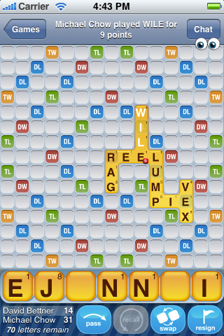 Words with friends is an Iphone app that allows users to create multiple scrabble games at once with different friends and have the option to come back to the game when ever it is their turn. The design of this game is so smart it's one of those things that make you wonder why no one did it sooner. Scrabble games are fairly quick games by design and I know a lot of people who like to play scrabble but the problem is finding the time to get together just to play scrabble. This application solves all of those problems at once. You can start a game through your contacts list on your phone or type in someones user name. I have seven different games going now but I'm not sure how many at once you can have. When it is your turn to play the computer automatically sends you a pop up notification and fills in your new letters for you. There is also a chat button so you can send messages back and forth through the application with the person you are playing. The game also has eyes that pop up in the corner of the screen to let you know that your opponent is looking at the board. I feel that the designers of this free app thought of everything you could want to make scrabble fun again with your friends not to mention strengthening your vocabulary. The only downside is that ads will pop up between plays. There is a 99 cent version that eliminates the ad's I believe.
Wednesday, December 2, 2009
Anime Simpsons

I found this while searching for fan art. I really like this design because it hits home with me in a way but on strange level. The Simpsons was always one of those TV shows my parents wouldn't let me watch growing up so it always had that mystique about it. I would sneak in an episode here or there and once I became older watched it when I pleased. But the design of this photo has a very nostalgic feeling to it even though it looks like a depiction of what the Simpsons show would have looked like as an anime series. That's maybe why I like the design as well because it puts an interesting yet different spin to something close and familiar. I appreciate all the cast around the TV because that is one of the main family portraits for the show and also in every beginning of the show a there is a different intro as to how the family arrives in front of the TV. I'm going to try and find more pictures of what things would have looked like if other people had created them.
press hop
This is a video done by DJ Steve Porter that incorporates a bunch of famous sports press conferences into a mash up rap music video. This is an incredible design for the sheer creativity and ability to make something like this. I have no idea how he was able to hear the different parts and put them together over a beat that he created. His first mash up video he did was of the Slap Chop infomercial. That video gave him enough views for FOX news to do a piece on him. A part of this video, "Press Hop", was even shown on ESPN's sports center. To put something like this together and submitting it to youtube not only gets his creation out there for everyone to see but also his talent to future employers and possible clients and customers. Famous artists or people in general might seek him out to do videos on them. This is the best free publicity you could give yourself.
Tuesday, December 1, 2009
Cool Advertising
 This is advertisement for the new movie "2012" in a subway tunnel somewhere where they used decals on the floor and sides of the wall to make it look like water was flooding the tunnel. This is an extremely creative way to advertise a movie. Instead of walking by a poster and hoping that someone will look at, this grabs the passersby attention with a bit shock value and panic. If it weren't for the films name and maybe some other pictures on the side it might actually look from the corner of your eye that something bad is happening. I've seen other uses of advertisement in subways, one for the mini cooper, using eye catching decals. I've found that this was in Rio de Janeiro but couldn't find who made it to see what else they've done. From what I've found it seems that other countries use more creative advertising than Americans. My guess is that foreigners are more frugal with their money, I could be totally wrong, but advertising companies don't have to work as hard for us to spend our money on things we don't need.
eco boxes.

I first came across this new packaging for music, games and movies when I bought a copy of Modern Warfare 2 for the xbox360. My first reaction when I felt the box was that something was missing and, why is it so flexible and weak? Well when I opened the package this is what I saw inside with a game disc in place of course. My first reaction was a wondering of why? And then my second reaction was, "they must be getting cheap on us." To be honest the box has no real protection for the disc except someplace to store it so it won't get scratched. My friends and I couldn't figure it out. www.ign.com released an article about the box and how the media industry is pushing for these new boxes because they save on packaging weight and carbon emissions when produced. The dvd and blueray producers have jumped on board all ready switching over to these packages primarily with the game industry starting to make the switch. Walmart is pushing for all media sold in their stores to use these packages by 2013. After reading more on this design I came to the conclusion that if it is safer for the environment, uses less resources, and saves on shipping costs which in turn might lower the price of the product, by all means package all the media you can in these. After all, those boxes just sit on a shelf next to my TV.
Subscribe to:
Comments (Atom)