 These are Trix cereal boxes one is a retro release and the other is the normal release. They both look very similar but with slight differences. They've still used the only green on the box for logo. I'm guessing they did this so the name would have a popping effect to it. The rabbit on the other had is very different. One seems very relaxed while the newer one has an extreme expression of excitement and energy. Thy might have changed that because children would move towards that expression more. They might have re released the older box so more adults would start buying the cereal. The cereal itself is also more vibrant and colorful in the newer trix box. I personally like the older one better, It has less going on with more of a chill yet cool factor about it where the newer box to me screams eat me I'm full of sugar and excitement.
Wednesday, December 16, 2009
Trix Box
These are Trix cereal boxes one is a retro release and the other is the normal release. They both look very similar but with slight differences. They've still used the only green on the box for logo. I'm guessing they did this so the name would have a popping effect to it. The rabbit on the other had is very different. One seems very relaxed while the newer one has an extreme expression of excitement and energy. Thy might have changed that because children would move towards that expression more. They might have re released the older box so more adults would start buying the cereal. The cereal itself is also more vibrant and colorful in the newer trix box. I personally like the older one better, It has less going on with more of a chill yet cool factor about it where the newer box to me screams eat me I'm full of sugar and excitement.
artifical shade
 Designed for urban areas without a lot of trees these benches have a flower like structure coming from the tops of them to provide the sitter with shade from the sun on hot days. The center of the structure also has a device to catch wind and store its energy and turn that into a lighted are to sit at night. The idea of this is a good one yet for some reason I don't like the way they've designed these at all. Depending on the place where you put this, you may or may not want it to look like a flower. Also what if you don't live in a windy area, would the lights at night be useless? Instead they should make the shade "petals" with solar panels on top. I think that would be a more effective way of harnessing the energy. also I build in a tilt function because the sun doesn't always stay in one spot.
Jimmy Deans
 I like this advertisement a lot. It gives a good sense of morning time and wanting to have some of that breakfast sausage. The colors used I feel have a warming sense to it that the sunrise usually has in the morning, a sort of golden glow. Its even better that they use the design of a "rising sun" pattern. The traditional oriental rising sun is usually in red and white I believe but when you take it out of that color scheme and use it in this sense it really ties the feeling of morning time together. Pulling the red from the package and using that for the overhead text is a good idea as well since its also a warm color. Having the food in the corners and not overpowering the image lets the package shine through but also allows the viewer to get a sense of what the product is used for if they didn't already.
power cart
 This thing is a new take on the street vendors by having a portable stand that a passersby can stop pay a few bucks and get their cell phones or other wireless devices charged. The cart looks pretty simple with a wooden box design but I'm guessing the technical know how comes with the solar panel that is attached along with a crank on the side just in case the sun goes behind a cloud. I'm not sure how you would wire something like this but if you had the spare time it might be a good idea to make if you had some spare time on the weekend. One downside i could see to this is having to stand at the station while your cellphone or device is being charged and depending on how long your device takes to charge what you could do to fill that time. Also if it started to rain or lightning all of a sudden having your device get fried. Also things to take into consideration are, if more people plug in at once does it slow everyone's charge rate. Good idea overall for a street vendor. I have been stuck in public with a dead cellphone before and would have loved to have one of these around.
golden arches

The golden arches. You already know what they represent with out even having to think. Your taste buds may either start to salivate or your stomach start to turn but either way everyone gets an instant reaction to this sign. McDonald's did an incredible job with their emblem and marketing for everyone practically in the world to know what the golden arches stand for. I personally like the sign. It's somewhat nostalgic in a way but I also like the way the gold pops out on their standard red back ground. The arches make a sensible M which everyone assumes stands for McDonald's. The arches were actually a part of the restaurants building design. They later took the arches and put them together to create the M for their logo. The red on the sign comes from the original design for the building as well with the floor and wall tiles being a distinctive red and white. McDonald's may never go under due to this M.
Monday, December 14, 2009
Text Rain
 Text rain is a digital art piece designed by Camille Utterback. It is designed so that an image of falling letters is projected onto a wall that viewers can walk in front of and interact with. What ever image the user projects onto the wall the words will interact with it by stopping their downward motion and sliding off to the side very similar to rain. If the user is able to stop a large portion of the rain they will be able to see that the letters form words and sentences that make a poem. I really like this idea of art and interaction. It also brings in a lot of elements pertaining to new media. It would be a cool idea if there were more options of maybe turning the letters into images or one solid image with raining pixels that could be stopped and stacked to make a picture. I think there is a lot of potential with this kind of technology with computer and user interaction on a artistic and educational platform.
Wall Decals
 I found this and other wall decals and dalidecals.com. I live in an apartment that, for some reason, won't let us paint our walls. If we want to paint, depending on the color, we have to put a non refundable deposit down between 150- 350 dollars. I tried to think of another option to decorate a wall and I stumbled upon these designs. What they are are vinyl stickers that you adhere to any wall or surface and later peel up. For this tree they send you the trunk decal and all the separate leaf decals so you can place them in any fashion you would like. The decals run anywhere from 25-200 dollars depending on the size and different colors. You can also choose any colors you would like the decal to be. I think this is a great way to decorate a room or wall space for any home size.
Sunday, December 13, 2009
Toas Printer
 This is a toaster designed after an inkjet printer. It is an awesome design concept. You stack the bread on top of the toaster and it feeds it through, toasting the bread one slice at a time. I like the idea of this if you only need one piece of toast at a time but if you were making a sandwich or had to feed a whole family at once this may not be the most practical design for your kitchen. I'm guessing it takes a little bit of time for the bread to toast but it may be as quick as an actual printer. It may have been cool to ad a compartment for butter or jam to be spread on the toast towards the end, being more similar to a paper printer. Overall still a cool idea.
sandwich
 The design of a sandwich is a simple yet attractive one. It has all the ingredients of a balanced meal, grains, protein, dairy, and vegetables all in one delicious package. The way the sandwich is built, with the bread on the outside, is designed to be eaten with your hands without getting the contents on your fingers. The bread acts as a protective layer, soaking up any moisture that would otherwise leak out. The bread also acts a protective heat layer. If you want to grill the sandwich the contents will warm up in the middle without getting burnt. The sandwich is easily and quickly made and is a popular food item to take with you to work or school or any occasion where you might be hungry later. The sandwich originated in the middle ages by people using slices of bread as plates to eat their meal and then later eating the bread. It eventually evolved to eating the meal with the bread on both sides. Sandwiches are one of Americas most popular food items.
Tuesday, December 8, 2009
skoota
 This thing is an urban compactable emission less scooter. My main problem with it is the way it looks. I would not feel safe by any means driving this thing down the road whether it had a gas motor or not. It runs off of ion battery technology some how with an in wheel motor on the back wheel and disc breaks on the front. I didn't say what the top speed was but I hope for the riders sake it's not fast. The design concept is for people to use this inside the city with very short travel points. It didn't say how long the battery lasted either or how long it takes to charge it but those things would have to be considered before taking this out. It also harness solar energy some how as well. I found it's target audience to be 20 to 35 year olds. I guessing they would have to be a reasonable weight as well. My main point against this is why wouldn't you just buy a bicycle instead? You may have to pedal, but at least you know you wont get stuck anywhere and its probably a whole lot cheaper.
Castoven

This thing is a microwave oven with an led screen built into the window that automatically plays youtube videos from your computer when you are cooking something. I can see a lot of great ideas that would stem from this design. They way they have it set up now is that your microwave has to be connected to your computer, possibly wireless, but I think they have this prototype wired for now. The program works with a program that youtube has to instantly stream video. This design would be better if they used it for more than just youtube. If they created a way to integrate the kitchen TV into an already existing appliance would save space and possibly money. I do believe they make TVs in refrigerators but how many people want to stand in front of the fridge to watch TV. People already stand in front of the microwave to wait for their food so why not have a TV in there. It might be cool to somehow have the screen disappear when the food is done so you can see the food again through the screen, but also have options to leave the TV on for longer if you choose.
Words with friends
 Words with friends is an Iphone app that allows users to create multiple scrabble games at once with different friends and have the option to come back to the game when ever it is their turn. The design of this game is so smart it's one of those things that make you wonder why no one did it sooner. Scrabble games are fairly quick games by design and I know a lot of people who like to play scrabble but the problem is finding the time to get together just to play scrabble. This application solves all of those problems at once. You can start a game through your contacts list on your phone or type in someones user name. I have seven different games going now but I'm not sure how many at once you can have. When it is your turn to play the computer automatically sends you a pop up notification and fills in your new letters for you. There is also a chat button so you can send messages back and forth through the application with the person you are playing. The game also has eyes that pop up in the corner of the screen to let you know that your opponent is looking at the board. I feel that the designers of this free app thought of everything you could want to make scrabble fun again with your friends not to mention strengthening your vocabulary. The only downside is that ads will pop up between plays. There is a 99 cent version that eliminates the ad's I believe.
Wednesday, December 2, 2009
Anime Simpsons

I found this while searching for fan art. I really like this design because it hits home with me in a way but on strange level. The Simpsons was always one of those TV shows my parents wouldn't let me watch growing up so it always had that mystique about it. I would sneak in an episode here or there and once I became older watched it when I pleased. But the design of this photo has a very nostalgic feeling to it even though it looks like a depiction of what the Simpsons show would have looked like as an anime series. That's maybe why I like the design as well because it puts an interesting yet different spin to something close and familiar. I appreciate all the cast around the TV because that is one of the main family portraits for the show and also in every beginning of the show a there is a different intro as to how the family arrives in front of the TV. I'm going to try and find more pictures of what things would have looked like if other people had created them.
press hop
This is a video done by DJ Steve Porter that incorporates a bunch of famous sports press conferences into a mash up rap music video. This is an incredible design for the sheer creativity and ability to make something like this. I have no idea how he was able to hear the different parts and put them together over a beat that he created. His first mash up video he did was of the Slap Chop infomercial. That video gave him enough views for FOX news to do a piece on him. A part of this video, "Press Hop", was even shown on ESPN's sports center. To put something like this together and submitting it to youtube not only gets his creation out there for everyone to see but also his talent to future employers and possible clients and customers. Famous artists or people in general might seek him out to do videos on them. This is the best free publicity you could give yourself.
Tuesday, December 1, 2009
Cool Advertising
 This is advertisement for the new movie "2012" in a subway tunnel somewhere where they used decals on the floor and sides of the wall to make it look like water was flooding the tunnel. This is an extremely creative way to advertise a movie. Instead of walking by a poster and hoping that someone will look at, this grabs the passersby attention with a bit shock value and panic. If it weren't for the films name and maybe some other pictures on the side it might actually look from the corner of your eye that something bad is happening. I've seen other uses of advertisement in subways, one for the mini cooper, using eye catching decals. I've found that this was in Rio de Janeiro but couldn't find who made it to see what else they've done. From what I've found it seems that other countries use more creative advertising than Americans. My guess is that foreigners are more frugal with their money, I could be totally wrong, but advertising companies don't have to work as hard for us to spend our money on things we don't need.
eco boxes.

I first came across this new packaging for music, games and movies when I bought a copy of Modern Warfare 2 for the xbox360. My first reaction when I felt the box was that something was missing and, why is it so flexible and weak? Well when I opened the package this is what I saw inside with a game disc in place of course. My first reaction was a wondering of why? And then my second reaction was, "they must be getting cheap on us." To be honest the box has no real protection for the disc except someplace to store it so it won't get scratched. My friends and I couldn't figure it out. www.ign.com released an article about the box and how the media industry is pushing for these new boxes because they save on packaging weight and carbon emissions when produced. The dvd and blueray producers have jumped on board all ready switching over to these packages primarily with the game industry starting to make the switch. Walmart is pushing for all media sold in their stores to use these packages by 2013. After reading more on this design I came to the conclusion that if it is safer for the environment, uses less resources, and saves on shipping costs which in turn might lower the price of the product, by all means package all the media you can in these. After all, those boxes just sit on a shelf next to my TV.
Wednesday, November 25, 2009
Pizza
 Pizza, whoever designed this was a genius. You have a delicious food that includes your grains, your vegetables, meats, and dairy all in one tasty easy to eat package that you can hold in your hand. Pizza has to be one of my favorite foods due to its overall appeal. The aroma, the flavor and the look some how just has a delicious factor. I've eaten really bad pizza just because it was still pizza. You would think the sauce would make the dough soggy, but it warms up and compliments it nicely. I'm guessing the heating process thickens the sauce by causing moisture to evaporate. And that steam probably rises to melt, but not burn, the cheese. Brilliant. I read that pizza originated from the Greeks who used to rub oils and herbs on their bread. Then a small town in Sicily, Italy, had a shop that put tomatoes on top of their bread, later in 1889 adding cheese, then creating the modern day pizza.
Monday, November 23, 2009
lighted cap

This is a baseball cap with a solar panel on the bill and led lights underneath so the wearer can see whats in front of them at night. I like the idea. I'm assuming its intended for campers and backpackers. If you were to use this around the house to fix things under the sink or in dark places I'm sure you wouldn't want to leave your hat outside for a few hours first. From what I know it doesn't have a battery back up. Being an Eagle Scout I would have loved to have this on the trips i went on. It would have saved a lot of time finding a flashlight and trying to set it up somehow while starting a fire or setting up a tent. Hands free light is a must in the pitch black dark while camping. It doesn't say how long it needs to charge or how long the charge holds, and would it work if it rains all weekend? Those things would be good to know before getting stuck somewhere with it. Honestly, due to those factors, mainly the one about it being charged by the sun, I'm not if I would invest in it. You can always bring more batteries with you on a camping trip for a conventional flash light.
Floating Stairs

I think I'm really starting to like things that float. These are floating stairs. They are designed to look as if there is no frame or supporting structure for the steps. The glass on the side had to be there for the support and it looks like the steps are bolted somehow into the glass. There is something about the magic effect of floating that really appeals to me. It maybe the inner self that always wanted to fly. My concern with this design is the glass and the space between the steps. I'm sure the glass sound enough, but if you got a crack in it somehow and didn't know, and it broke while you were walking down the steps, that would not be good. Also if you have small children or pets, there is a possibility of falling through or getting caught. I would suggest these for a bachelor pad, young trendy couple or a contemporary office. People like to mount their TVs so it looks like it's floating, why not more things?
The minimalist watering can

This is called the minimalist watering can. It was designed to water your household plants while keeping the water where it needs to go, in the plant vase. Conventional cans you have to tip with the possibility of the water coming out of the top or running down the side ruining carpet or the like. This simple design allows you to easily navigate the water where ever you want with the rubber house. It says there is a built in magnet in the hose to attach it to the side. I think this is a great idea, the only downside I thought of was having to use both hands, but compared to getting water everywhere seems to be a fair trade.One other possible downside is due to its height it might be hard to fill in some sinks. Don't be surprised if you see these in Target or somewhere soon.
Comedy Posters


So, I got to thinking. What is going on with big red letters, or the color red in general and comedy movie poster? Maybe the public hasn't noticed this yet or maybe the movie company advertising teams all got together and decided what color was going to represent funny movies so people subconsciously relate humor with the color red. Who knows. I like the color red with the big fonts and strait forward letters. It does for some reason have that, hey this is going to be a funny movie look to it. It's strange because people always associate red with danger, and no or stop. Wikipedia also says its associated with anger, sex, passion, sin, and pain. Some countries do associate it with luck and happiness. The only thing I could find on the web about the assocaiton with red letters and comedy movies was a spoof that collegehumor.com did about red text, so I guess I'm not the only one that noticed.
Friday, November 20, 2009
Website Background
This is an awesomely designed background for a website.
As you scroll down the page the image changes to something different. It is a very simple design but it has a huge effect I thought. At first you don't really notice it as you read the page and scroll down slowly, but once I realized that the sides were different it made me wonder how they had changed. I sped up the scrolling and figured out how they did it. I'm guessing both images are always there in the background and then they use the color gray that fades to black in the foreground to filter out which image is being shown at the certain spot in the page. That is a really cool idea. I feel that same idea could be used in other types of advertising or billboards. Simple yet effective design.
As you scroll down the page the image changes to something different. It is a very simple design but it has a huge effect I thought. At first you don't really notice it as you read the page and scroll down slowly, but once I realized that the sides were different it made me wonder how they had changed. I sped up the scrolling and figured out how they did it. I'm guessing both images are always there in the background and then they use the color gray that fades to black in the foreground to filter out which image is being shown at the certain spot in the page. That is a really cool idea. I feel that same idea could be used in other types of advertising or billboards. Simple yet effective design.
fold up helmet
 This thing. This is a fold up textile helmet for walkers or cyclists called a "TopUp". My first reaction to this was, "are you kidding me?" It looks ridiculous. I would never be caught wearing one that's for sure. Those people look like Toad from Mario Brothers. The idea on the other had is some what of a good one depending on how well it holds up. It is a cloth, light weight, compactable helmet that is supposed to be an alternative to a rigid hard helmet that is awkward to store on your person while not using it. I can see the space saving idea as a good one but most hard helmets are already light weight, and I'm not really sure how safe I would feel with a cloth helmet. It has a "honeycomb" like structure to reduce impact but who knows how well that will work really? I personally think this is a terrible design for a helmet.
Wednesday, November 18, 2009
last.fm
Last.fm is a digital music site and new application for xbox live that allows user to log on, search for an artist and listen to that artists and others similar to them streaming live. The design of the program is to provide music at no cost to the listener but with limited accessibility by not being able to choose the actual song. While the media is streaming, photos of the artist play in the background and album and artist information come up as well. I really like this design because I am always doing stuff around the house and don't have a radio, and If I did I wouldn't listen to it because I hate the radio. This is an amazing alternative for someone like myself to turn on their xbox and tv and listen to their favorite artists while doing house hold chores or homework. Brilliant. The design of the logo is simple yet unique. The animation that goes along with it draws the a into the s and disappears creating a brief infinity symbol which on music playing devices is the loop button. I like that too. Pandora is a very similar service but I would give this one a shot first.
Floating Bookshelf
 I really like this design. The idea of having a bookshelf without the bookshelf has a sort of magical effect to it and not only looks appealing on the wall but also triggers the brain to think about what is missing and how did they do that? I used this design for my bedroom on a larger scale covering the entire wall with books without having a "bookshelf". The effect is very powerful. Seeming that bookshelves can vary from 40 dollars to well over a few hundred dollars, it is a cheap alternative to buy the hidden brackets at fraction of the cost. It also saves time and energy during times of moving because you don't have to lug around or take apart a large wooden or metal structure.
wireless charging mat

The wireless charging mat is a device designed to charge your portable devices such as cellphones, ipods, and portable video games, wirelessly by placing your device on the "power mat". This product looks cool and that is about it. I looked further into this and actually interacted with one at a Best Buy. The design of the mat looks like a small skateboard which has a coolness factor built in but the mat has to be plugged into a wall, obviously to send power to the mat. The portable devices that rest on the mat have two options to receive juice. One, use the provided power cube which has a cord with a plug on the end that comes with exchangeable adapters to fit your device. Then you set your device on the mat and the power cube which is wired to your device sends the juice. So pretty much you have to take more steps to charge your device "wirelessly". The other option is to buy a case that has the cube built in. 2 problems with this. This case makes your device twice the size with a hard rectangle on the back, and the those cases cost upwards to 40 dollars. With the pad costing 100 dollars to start this seems impractical. This design sounds great in theory, "charge your device wirelessly", but in all actuality it is terrible. You might as well buy a power strip from Wal Mart for 5 bucks and plug all your device's charger cords into that.
Monday, November 16, 2009
Football
 The American football. The design of the football at first glance looks kind of weird. If Americans weren't used to what it looked like and also associated it with an amazing game would anyone really know what it was used for. It has an odd shape with laces only coming out of one side and white stripes on both ends but only on one half of the ball. And why is it made with the material and color used? Come to find out the ball was derived from the rugby ball which is similar in shape but larger and with rounder ends. The color of the ball come from the color of pigs bladders that were dried out and spread over the ball to prolong its life. Today the ball is made from leather case and rubber bladder. The white stripes are put there for better visibility of the ball and the laces are where the bladder is inserted. The laces also provide a grip to help throw the ball. The leather is also pressed to have tiny bumps to improve grip as well. The American footballs design has been slightly improved over time but the basic shape has pretty much stayed the same. Its cylindrical enough to be thrown through the air while round enough to be held and ran or kicked. I don't think there could be a better designed ball for American football.
Friday, November 13, 2009
Flask Flip Flop
 This is a flip flop made by Reef that is not only a device made for walking but also drinking as well. Inside the sole of the flip flop there is flask that can hold anyone of your favorite beverages. I love this design. Instead of having to carry/ hide a flask in your pockets or belt when going to a concert or outdoor event you can conveniently hide it in something that you are already wearing that happen to be comfortable as well. The shoe even comes with a little funnel to help get the liquid inside. On the bottom of the shoe there is a gauge to see how much of the liquid is left. I can see some down falls of having to drink from your shoe, such as having to drink from your shoe. There could be a bit of a sanitation issue there if you didn't have something to pour the fluid into, especially if you stepped in mud. I could also see getting sand in your drink if you happen to be at the beach. At a price of 40 dollars I would have to consider buying this product. On one had it seems like a really handy device for certain times but on the other is it worth the hassle?
Tuesday, November 10, 2009
Joker Poster
 This is a teaser poster for the move The Dark Knight which came out last year. I really like the design for this poster. The colors and over all texture and feel of it give a great sense of what the tone of the movie is going to be like. If people don't know who the dark night is, most people know what the Bat symbol is and how it is related to Batman. It also hints at who the main villain is going to be. The use of the Bat symbol with the graffiti eyes and the light hitting the brick wall gives a striking resemblance to the joker.
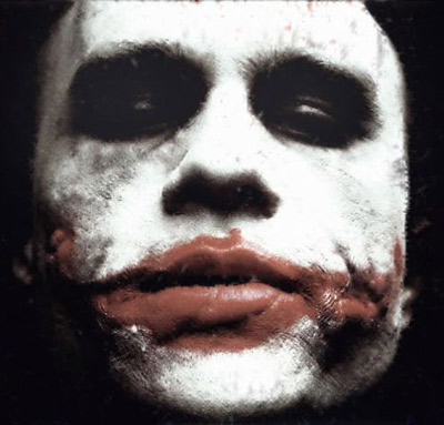 The red for the bat symbol instead of the standard black definitely throws you off. But works great at emphasising who the face on the wall is. I think this poser is an extremely clever way to say a lot about a movie with out really saying anything at all. You know it's going to be dark, you know who the main characters are going to be, and those two things are enough to excite you to go see the movie to find out more.
Plastic Containers

The design of plastic containers in theory is a great one. I like the idea. I like what they do. They are a convenient way to store food and liquids, cheaply and effectively. They are stack able, reusable, microwaveable, dishwasher safe. If you drop them they wont break. Even plastic bottles from vending machines are a great storage design. Its an easy way to package a single or more serving of soda or other beverage neatly. You can even screw the cap back on if you aren't finished with your drink. Try that with glass bottles. I think all the greatness of these devices have blinded a lot of people of what these things are actually made from. I have always known they were made from petroleum but I don't think I actually analyzed that for food storage. What happens to plastic that is heated up? After doing some research I have come to the conclusion that storing and cooking food in plastic is only safe and a good idea if done properly. Only microwave plastic that is microwave safe and only freeze plastic that is freezer safe. I've also read not to have plastic wrap or storage bags touch your food in the microwave and use paper towels instead to cover your food. All this is due to chemicals that can be released into your food, which in turn will be released into your body. So use the design of plastic storage containers safely.
Monday, November 9, 2009
Macy's
For as long as I can remember I have never liked Macy's logo. Every thing about it I don't like, the type set, the red star, and the way they use the star instead of a '. I appreciate their tradition as a holiday season type store and the Thanksgiving Day parade they sponsor every year in New York. They might use the color red for the star in that manner, relating it to the Christmas season and also the star itself could resemble the star over Bethlehem. "Come to Macy's, follow the star." It gives it a nice feel holiday feel to it. But the reason I think I don't like this design, is because of that same star, and I'm surprised it didn't get changed around 50 years ago. The five pointed red star is the symbol for communism and also socialism which our country went to war for several time. Every time I see the star I think of Vietnam, and the Cold War with Russia. Not exactly what you want to relate your logo with. I feel it would be similar to a company today creating their logo that is similar to a Taliban or other terrorist organizations symbol. That is just bad advertising.
xbox 360 Laptop

Someone decided to design a xbox360 that would function as a laptop with full keyboard and hd display. I really like this design, possibly because I love video games, for the idea of being able to play video games where ever I go. I don't think that Microsoft licensed this product, but for future products should consider it. The laptop, I wouldn't consider, is not fully portable. You do have to plug it in where ever you go. I figure this is because of the huge amount of energy it takes run an xbox 360 and there probably isn't a decent sized battery that could handle the load and fit inside. I also read it weighs about 12 pounds which I don't think I would want to lug around. It is fully functional with the USB ports and 4 wireless controllers. It was also upgraded with the wireless Ethernet adapter. With 21.2 million people already owning a 360 and about 40% of Americans owning laptops, I wonder how many more would cough up the money to purchase one of these if they were available in retail stores. As much as I like this design, I don't think I would buy it until they found away to make it lighter and cheaper.

Friday, November 6, 2009
The coke bottle
 The coke bottle I would consider an icon of American culture. When you look at it you know exactly what it is without even having to read what is on the label. For some reason I love the coke bottle design. It design with the red cap and cursive writing makes it look elegant and trustworthy. I know exactly what is inside of the bottle is going to taste like. The whole thing has a nostalgic feel to it. I did a some research and found that the famous logo was made in 1885 with Spencerian script which was the dominate formal handwriting for that time. I'm assuming they were marketing the drink to a classy to drink. The bottle design was made by Earl Dean via a contest that Coca Cola set up with its bottle distributors. They wanted something that would be recognizable immediately even if the bottle was broken. Dean was inspired by the cocoa plant pod, which in the original formula cocoa was used, and it's shape so he used that idea to form the bottle including its ridges. They have used logo and bottle designs ever since.
Wednesday, November 4, 2009
Megabus

You may have already seen these buses around town or possibly even ridden on one. The design of the Megabus is great, getting passengers from point a to point b cheaply and conveniently. They travel between Midwestern cities and I believe one other group of locations in the east. Their fare system is based on a first come, first served bases, where if you are the first to sign up for a seat on a specific day your fare can be as low as a dollar, where as if you are the last you would have to pay significantly more. The most I've payed for a two way ticket to Chicago was 26 dollars. That wouldn't even get me a tank of gas in my car. Great deal. They don't have bus stations and they don't have ticket counters. They use an online system for their ticketing and designated pick up/drop off site for their "bus station". They are designed to keep prices low for their customers by sticking to the basics, bus and bus driver. I would recommend Megabus for your next trip to a nearby city.
Monday, November 2, 2009
Ebooks
 Electronic books, or better known as Ebooks, are a new trend amongst people who have a problem with paper, or just flipping pages maybe. The device that you have to buy to read an ebook can run from 100-300+ dollars. The ebooks themselves run on average about 10 dollars. To me, this design for reading books is ridiculous. Have these people never heard of a library? You can read all the books you want for free. However, I do have an Iphone, as do many people, and a growing trend is buying ebooks through the app store. I can say I've looked through the list of books and many of the classics are for free, but there is a limited amount of popular best sellers and authors. I feel the cost of an ebook reader is way over priced but since I have an Iphone I would probably buy ebooks from the app store on a limited basis. The cost of the ebooks themselves are reasonable since you should still have to pay for the content to support the author and publisher, and besides you save 5 to 10 dollars per book by not buying the physical version. I found a sales graph for ebooks and they have risen dramatically in the past 2 years. My guess is that the Iphone played a major roll in that.
Space Truckers
Space Truckers
I found this article on the NPR website about "space truckers". The idea of it is to have private companies eventually being the ones, instead of NASA, to move equipment and people back and forth from Earth and the International Space Station. At first I wasn't sure if I liked the idea of this much. Corporate America, in my mind, shouldn't be messing around in space. But, the more I looked into the design it actually seemed to make sense. The government operated NASA can spend more time and money towards exploration and science while the corporate world can compete to see who can make the best craft for two way space travel and do it more efficiently and cost effective. My concern is with the training that would be involved with operating the crafts. Would these private companies use existing astronauts to move their goods, or would they start a new training program for any qualified individual? And who would be considered a qualified individual? After looking into this change of space travel I feel it is a good idea, but needs to be very carefully done.
I found this article on the NPR website about "space truckers". The idea of it is to have private companies eventually being the ones, instead of NASA, to move equipment and people back and forth from Earth and the International Space Station. At first I wasn't sure if I liked the idea of this much. Corporate America, in my mind, shouldn't be messing around in space. But, the more I looked into the design it actually seemed to make sense. The government operated NASA can spend more time and money towards exploration and science while the corporate world can compete to see who can make the best craft for two way space travel and do it more efficiently and cost effective. My concern is with the training that would be involved with operating the crafts. Would these private companies use existing astronauts to move their goods, or would they start a new training program for any qualified individual? And who would be considered a qualified individual? After looking into this change of space travel I feel it is a good idea, but needs to be very carefully done.
Thursday, October 29, 2009
Digital Ice Maker

This is a high capacity digital ice maker that makes a tray of ice in no more than 10 minutes. They designed it for RV's, game rooms, and home bars. I like the idea of the design to have ice where ever you can find an outlet, but how often do am I asking myself, gosh I wish I had some ice. I feel this was designed as more of a luxury item for people who can afford things such as a RV, or game room. At a near 300 dollar price tag I think I will stick with the ice maker in my fridge or the bags of ice at the grocery store. I did find that Americans on average use about a pint of water as ice a day. The energy consumed to turn that water in to ice turns out to be about 5,000 tons of coal or 17,000 barrels of oil. That energy is used to take the energy out of water to turn it to ice. When Ice melts it regains that energy, so in the process of making Ice it seems we are just wasting natural resources. If Americans want to start conserving energy more I would not recommend this product.

Wednesday, October 28, 2009
Digital Penguin

Digital Penguin Christmas Ornament
This is a Christmas ornament that was designed to hold a little lcd screen in the stomach of a penguin that changes pictures of what ever you upload to it. It holds about 65 pictures with a jpg or bmp format. It made me wonder would anyone buy this? I found out that a lot of people actually buy digital picture frames for their home or office and it would be practical that those consumers would extend that to their Christmas trees. I did find ornaments that hold a single picture that you would have to cut out from a print , I believe my mom might have even had one. I think this ornament, as small as the screen is, would be a plausible thing to buy for the capability of having more than one picture in your ornament. I found other larger digital picture frames that as well as showing multiple pictures played music as well. Maybe this ornament could be reissued somehow with a mini speaker that played different Christmas tunes.
Digital Candy

Digital candy. Someone decided to make bubble gum shaped in the form of technological devices such dvd’d, mice, hand held video game devices and keyboards. Why would someone go to great lengths to create such weird looking candies? It’s a possibility that children as well as adults love new tech gadgets and they are more likely to try something that looks like something they already love. I personally wouldn’t be turned on to something like this if I saw it in a store. Kids on the other hand I feel would be attracted to it because maybe these are things that represent objects that their parents have and can’t play with or can only use for a limited amount of time. Therefore, when they see this they want it because it is something they can’t normally have and will want it even more. Their parents knowing its just candy will be more than likely buy it for them since it is just candy. Furthermore, people have been chewing gum for ages. It has been recently found that chewing gum could possibly increase brain function and help with better grades on exams. On the downside children under the age of 5 shouldn't chew gum because of a natural instinct to swallow what they are eating, so maybe this package should come with a warning.
Flip Phone

I have always liked the design for the flip phone cellphone. I remember watching Nash Bridges on TV when I was a kid and remember watching him use a cellphone that flipped open and from then on always wanted one. I think the design of a flip phone largely impart takes its basic idea from a laptop computer. When you flip it open its ready to go when you close it you know its still on but waiting for you to use it again in the near future. I think also the appeal of the flip phone is the same idea of "look at this tiny laptop computer I can make calls on". Part of the reason they might have designed the flip phone is to protect the screen and keyboard. On older phones the screen and keyboard were always in plain sight which something could be dropped on. At the end of 2007 55 million Americans owned cellphones, now its an impressive 250 million and still growing. The flip phone will soon be replaced with the smart phones but the flip phone was a great design.

Wednesday, October 21, 2009
play cologn

I first saw this bottle in a cologne add with Justin Timberlake. I'm not sure if it is his cologne line or if he was just the model. I thought it was a good idea, however, to have him in the add to reinforce the design of the bottle as a music player since he is a famous music artist. I feel the design of this bottle is very clever. It took me a second to realize that the cologne was called "Play" but once I did I had that ahhh, I get it feeling. The bottle also has a striking resemblance to an ipod or iphone which, like myself, people become extremely attached to. In return, the consumer might feel immediately comfortable with the product. Who knows how it smells? But I would give it a try.
Wednesday, October 14, 2009

When i first saw this design for a wine bottle label I liked it. There was something about that symbol that made it seem important enough to give it a try. I have yet to try the wine but I have done a little research on why this label caught my attention. I'm not so sure it has anything to do with font of the name or the name itself. I think it all has to do with that symbol in the circle. So I just happened to be watching a movie the other day and during the beginning credits I figured out why this label stuck out. It all has to do with Legendary Pictures logo and the movies associated with it. I like their movies so that design was subconsciously in my brain as something I would like if I saw it else where. Hence the similarity with the wine bottle display.
Monday, October 5, 2009
The tissue box

I never realized how well the tissue box is designed because it works so well. What better way is there to group together and dispense tissues? The ease of use by pulling up on one tissue already sticking out of the box will automatically bring up the next tissue for future use. The box also serves as a simple but effective method of protecting the contents inside. It prevents the tissues getting smashed and also protects them from the elements around them. The tissue box is a great design. Another similar designs that work great is a bathroom paper towel dispenser. It's like a giant upside down tissue box.

Thursday, October 1, 2009
Terrible Movie Poster

I'm not sure where to begin with this movie poster. At first glance without reading anything it has the feel of a promotional poster for some crappy new drama series for broadcast network television, like a detective show. But if you read at the bottom it says, "In Theaters". Well I guess it's a movie then. But what is this movie about? Well if I read the title I'm guessing a law abiding citizen, but who is the law abiding citizen? The guy on the right? The guy on the left? They both look pretty tough in black and white with stern shadowed faces. As far as I know they could both be either good or bad? It's also a good thing the designer put their names on their foreheads like misplaced name tag. He or she could have just stacked them in the middle. I'm guessing most of the general public knows who Jamie Fox is and then deduced that the other face must belong to the name Gerard Butler. In the end, do I have any new knowledge of what this movie is about? No. Do I have any more motivation to go see this movie? No. If anything I have less of an urge to go see this movie. The main change I would have made was to add a little tag line, like the old movie posters, about the movie like, "Taking the law into his own hands this October". That gives more of an action movie type feel. Which I'm guessing this is.
Subscribe to:
Comments (Atom)